Tuesday, April 28, 2009

Inspirational artist: Nathan Fowkes


Hi Peeps,
Here is an artist that I admire... probably you guys may know him but if you don't, his quick landscape paintings are beautiful and can aid in our development in plein air paintings. He currently works for Dreamworks. Be sure to check out both his blogs.

Landscape blog
http://nathanfowkes-sketch.blogspot.com/

his art blog
http://nathanfowkes.blogspot.com/

Artists from Class

Hey guys. I noticed that there actually was quite a bit available online for Repin. Last time I checked (about a year ago) there wasn't much, but now you can bask in his majesty! Here is a link to the other artist I mentioned, Darren Waterston. He's not really representational, but he has some very interesting textural and shape-based art. It may spark some ideas and is worth investigating. See you in class!

http://www.darrenwaterston.com/last.shtml

Wednesday, April 22, 2009

Jorinda & Joringel


Flamingos

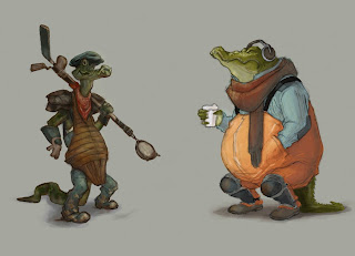
Gators - Nelson


Just in case...

Skunks


It still a WIP, but I'd like to thank everyone for the valuable feedback on such short notice.

Frogs Final (updated)-Miles


Manatees


These still need a lot of work - especially with the textures. They take a while to look right...
So this is what I have so far. I was planning to get a lot more texturing in there but I'm running out of time. I kept the boy's pose the same because I felt like it fit his character. I hope the grandpa's pose is ok. I was having problems with that one.

Value Crows


I'm posting again in case the shading doesn't show up on the printout, since its so dark. Hopefully its visible here, but damn, its still pretty dark.

Thanks for comments! Really helped out.

Character 02: "Gunner"


Here is another pass at my "Gunner" character. I'm hoping it works, I'll be honest, I think his design is a bit of a stretch. I wanted his costume to be a hodgepodge of junk that he wears/uses... His weapon isn't a gun, just some bundled up old sports equipment to knock stuff out of the way, and a strainer scoop stuff out. It ended up being a little "sports"-centric... Anyhow, still working out the colors. I wanted to unify him and my driver though their fisherman "overalls" and other cues like rain boots & stuff. I don't know... Color is killing me for this . Any help would be great...

Character Redraw

I am really struggling with the character poses, and getting their personality to read. Does the driver have the "yeaaaah" and gunner the "duhhh..la di da" attitudes? I will probably just color these due time . Thank you in advance!

Final Crows


Here they are so far. Tried out the Dora-technique. Any last suggestions are welcome.

Character 01: Driver


Hi guys. Here is a revised character from yesterday. Reworked an original thumbnail for my driver. Open to any suggestions/tips at this point... Especially if something is not working. Not sure if color palettes are working either. Tried to unify & harmonize it. Thoughts..? Thanks.

Monday, April 20, 2009


So here are the clothes ideas for the grandpa (driver). He's young at heart and addicted to speed... so yea. I don't know if any of these are really working, but I do like the feeling of the 4th and 6th one.


I missed class Wednesday, so I may be a little behind...
This is what I have for the little guy (gunner). I want to keep him innocent looking, but he has a big imagination and is open to adventures with his grandpa. Some of his props include a telescope a little slingshot.

What do you guys think?

crows color


Some flat color possibilities. Always open to suggestions. I'm thinking these guys are now grease monkey, chop-shop type criminals. Hence the coverall type clothes. I gave the last guy racing stripes in case crazy race car driver was cooler.

Sunday, April 19, 2009

Color Pass

Really rough color pass.

color comps


Here are some color studies for my characters. I would love to get some feedback and people's opinions on which are working best. For the big guy, I like the two on the ends best. I am thinking of making my driver rat albino with red eyes, but of course dirtier looking.

blocked in charcters


I just blocked in my characters for now and also showing the line drawing of them. If I could get feedback on design and whatever else needs improvement, that would be very helpful. thanks.

Friday, April 17, 2009

Dermot Power

Here's a link to his website with some cool concept work:
http://www.dermotpower.com/
I found it through this other site that has other artists I haven't heard of but are sweet. Enjoy
http://www.davorvaneijk.com/links.php

You'll watch it and you'll like it.

http://www.hulu.com/watch/55587/saturday-night-live-pampers#s-p7-st-i3

http://www.hulu.com/watch/57938/saturday-night-live-wii-guys#s-p2-st-i0

Tuesday, April 14, 2009

Monday, April 13, 2009


an update!

If anyone is checking around before class, go nuts.

final fanboat


This is what I have so far. I want to keep it pretty flat, but still maintain space and value.

Last minute fanboat


Any last minute suggestions are greatly appreciated. I'm usually in denial when it comes to tightening things up, so if there's any specific areas that need more work please don't hesitate to point them out. Everyone else's work is looking really nice!


It's been laborious working on this line drawing, but it was fun to paint. Once I added textures, I wasn't sure if it worked against the clean line drawing look I had going. I wasn't sure how 'flat' I should go, so I went somewhere between flat and rendered. Any thoughts...? I also have a bit of a 'poop' deck thing going...too weird?

Nelson: Fanboat Final


Round 02

Thank you guys for the feedback. Here's where I am tonight. Guess I'm been trying to really clarify my boat as much as possible and control color & values too. I get a little lost. I'm really open to suggestions at this point as far as texture, further clarity, values, what is not working, etc. Not sure if its clear, but like I mentioned in class, I wanted the shape to resemble an alligator's head, but not sure if that is reading clearly yet. Thanks.

Sunday, April 12, 2009

in progress


Here is my boat after its most recent coat of paint. It is still very, very rough, but I would like to get as much criticism as possible. It is a little more refined in other areas, and I know the light and shadow sides need to be defined. That is swamp muck on the skull, and blood on the cage. Any suggestions to make this better would be awesome!

My fan boat turned into a Monster boat!


Hey everybody! Happy Easter! Hope you all are having a nice day!
This is what I have so far on my fan boat. I still have to work on the color of the wood and on the stuff inside the cabin area. I am wondering if those red bits are too overpowering? I am thinking of adding some flames onto the plastic siding then the red would be more throughout the boat. Any thoughts on that? My idea was to make it like a kid's jungle gym-clubhouse mixed with fan boat-swampy everglades elements. Any other comments would be helpful. Thanks!

Nelson: Progress...

This guy is sooo far from finish. Just wanted to post something up. This is by far not the final color scheme. There's some color, but the brown was just there to lay in a underlying value plan. I hope to take it to a more painterly finish so the lines - i hope- will be gone. This is it for now... More 2morrow

Tuesday, April 7, 2009

Link to Jean-Baptiste Monge

Hey everybody! Here is a link to that amazing artist JP brought in our last class, Monsieur Monge.
http://www.jbmonge.com/
Enjoy!

Sunday, April 5, 2009

What I have so far..

The Sea Cows

Don't Worry, Be Happy!

Hey guys. I see a few of you are concerned/confused about what to do. My advice would be to start out thinking about the coolest looking designs possible. Often times it's easy to get locked up thinking about how exactly something works. Don't paralyze yourself by trying to make it too logical. Remember, it only has to LOOK like it works! Also, I don't have a problem with slightly oversized characters, or characters who don't "act like they're supposed to." Just look at games and film. There are plenty of examples of anthropomorphized animals that do not adhere specifically to the rules of their species. Woody Woodpecker, Chester Cheeta, Yoshi, Kung Fu Panda--the list goes on. Feel free to push the boundaries of what's possible!

Don't forget that it has to have the illusion of functionality, but we are not, for the most part, mechanics or engineers. Try to strike a good balance between reality and fantasy.


HELP!!!!!!!!!


I've been stuck on this fan boat forever! So hard! I dont know what to do. it looks so stupid. My animal is a woodpecker. As charcters, they're not smart and all they do is peck on wood. They have thick heads to keep from headaches when pecking, so basically, they're kinda stupid. I know it sounds wierd and funny, but thats what I read up on them. They eat berries, nuts, and ants. I dontknow how else to incorporate hill-billie-ness to this. If i could get some advice to make this look somewhat mroe decent than now. Thanks.

Gilded. er.., my FANBOAT (rough)

Here's a rough pass before I take to finish. My idea is to give it a feel of a broken down old dock, while maintaining the look/feel of a Fanboat. This has been one of my main problems. I really would like to push it more, and I will admit I've been struggling with the design. My characters are a couple of crazy-hick Gators. They're gruff, impulsive, and not entirely coordinated. Any feedback would be highly appreciated... Thanks.
Hey all,

I haven't made it to class to show my ideations since I've been holed up at home being sick. I'm still trying to tie one idea down before Monday, so I'd really appreciate it you guys can point out which ones are more successful than others or let me know what I can do to improve them. The ones I'm partial to are the two big ones on top.
Thank you!

Saturday, April 4, 2009


Hey guys, I have been doing some more ideating since last class, and here is one of the drawings I came up with. Right now the idea I am going for is extreme, manly men, dangerous swamp rats. I kept the croc skull, but only the lower jaw as the basic boat structure. The engine is a modified blender motor, and it is encased in a beat-up rat trap. The two cans on the side are hairspray, and can be ignited to form a crazy dual flamethrower of DOOM. The driver uses the old joystick to steer, and by sitting on top of it he is pressing the throttle. Aside from liting competetors on fire, the gunner also uses the mousetrap on the top to launch items of himself to nearby boats.

I think this feels more like a boat than my previous ideas, but I would like to get some suggestions and criticisms to make it more agressive (this is the badguy car) before I show it to JP. Thanks!