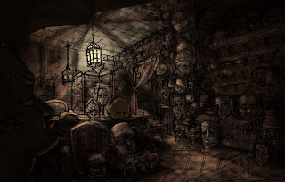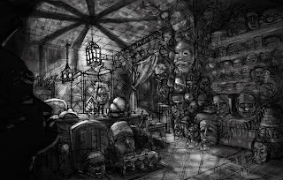

Hello! I have been working on my interior. From the beginning I wanted to use those beautiful Moroccan lamps somehow and the crazy light-shadows they make, but I am wondering if I have gone too far? Since there is so much stuff on the walls already? Also, the shadows on the ceiling make an x, which makes the eye go directly there...any ideas? I put something in the foreground of the color one, does that help?
Also, I am wondering about the palette, I am going for a warm analogous palette, with some accents of green..If you look at the colored one, there is a roundish mask on the main table, I painted that in pretty opaque. Does it look weird with that green reflecting light? I also feel like I lost anything I gained -photoshop paintingwise- from the last project..anyone else having issues?
The color one s looking really nice. I think putting something in front to cover up the "x" is a good idea. You could also try pushing the value of the shadow down so it doesn't contrast so much like the black and white version you have. I think you're doing that already in the colored version because my eye isn't getting stuck up there. But it has a cool effect.
ReplyDeleteI have no issues with the color choice either. I'm not sure what mood you're going for - but I'm definitely getting mysterious. The hints of green give it more interest I think.
I like where it's going! Can't wait to see it in class.
Glad you are getting the mysterious feeling! That is what I was going for! Thanks so much for your input!
ReplyDeletecovering the X really does help a lot, but it is definitely reading as a focal point for me, just because that is where the most contrast is. From far away that is about all I see, and unless I zoom in, it is really hard to see the green reflected light. But I like it! It doesn't look to strange at all, as long as you don't use it overwhelmingly.
ReplyDeleteAnd my photoshop painting is getting pretty clunky too...but Its early in the process. Right now you are probably feeling that way because you only have one thing painted opaquely. Just avoid object painting and I think it will turn out great!
I think the green would be a good complement to your red/brownish palette. As for the X, maybe disperse and feather the edges more as it travel furhter from the center, fading more etc. I think it's a strong piece over all!
ReplyDeleteThanks for the comments Vu and Liz, definitely helpful!
ReplyDelete