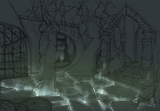
Hey, I hope everyone is progressing swimmingly. I was experimenting with lighting, and I thought it would be cool if my light source came from the ground. I though that since she had magic powers, it would be okay. What do you guys think? Is it too much? Thank you in advance.
Hey Justin, I actually think the floor lighting looks really cool. Very magical. I'm not sure if it would work as the only light source for the room, because if it got much brighter than it is now, it might lose its subtle magical feeling. I would experiment with some secondary lighting sources, just so half of the room doesn't end up completely in shadow...but that might look cool too. I just would play around a bit more, but it is definitely a really cool idea.
ReplyDeleteJustin, this environment is a lot more interesting than what you had before. I think the main chamber is great the way it is now, very moody and low-key. One way you can have a secondary light source is to maybe gently light the stairs on the right of the comp, with a nice warm light source from up the stairs (out of our view). That would create you main focal point and your eyes would travel down from there to the main chamber. The idea of the dungeon with light from the ground is badass. THis is an awesome opportunity for you to do scary shadows on the ceiling and hightlights on the bottom of the forms. Like shining a flashlight on your face from the bottom. Great stuff man! I also dig how you u got multiple levels and rooms. Maybe show some lost edges and fade things into darkness to give a sense of mystery. That stairway to the lower level to the right of the owl could use that.
ReplyDeleteActually Im not so sure about the crazy shadows idea in my comment. The ground light you have now is soft and it wouldn't create a lot of cast shadows, I like the ambient the way it is now. So just play around with it, good luck!
ReplyDeleteJustin, Great design of the room, much better than before. The lighting is awesome, you have great opportunities to play with the lighting coming up the walls and even playing with shadows on the owl statues. However the foreground element of the baskets seem off, they feel like they are flat on the ground, it needs a little more height into them..i believe. But its looking good and great idea with the lighting.
ReplyDeleteThank you for the feedback everyone. I really appreciate it.
ReplyDeleteHey Justin... just my two cents since you got some great feedback above. Similar to the basket comments I think your gate could be a little more threatening as well. Maybe a little taller and more sharp point, emphasize the vertical. Right now it looks a little too "neat" and in its tidy little place, not as gothic looking as the rest of the room. I like you redesign as well.
ReplyDeleteLooks cool! But adding to what everyone else said.. the statue figures you have in there don't feel scary to me.. Maybe look up gargoyle statues or something scarier looking. I'm not sure what those circular objects in the bottom left corner are. And like Nelson mentioned, it does feel neat.. maybe add some spider webs or skull heads from the beasts she's eaten or something. Just a suggestion. Looking good though!
ReplyDeletehey justin, looks really good. the lighting is cool, its going to be a fun challenge! otherwise, the gate design is too happy for that room. try to avoid curves and curly cues. everything else is crumbling and old. add some dents and ware to the gate, also to your animal figures. hou lang justin!
ReplyDeleteWhat is the focal point? Why is your focal point important? Keep that in mind as you take this piece further. Manipulate the lighting to suit your needs.
ReplyDelete