Thursday, May 21, 2009

final


Hi everyone, how was the partyyyyy last night?
I slept 15 hours straight! It's definitely my new record of straight sleep time.
It's longer than a flight to Japan!

Anyways, here is my finals. It's a bit different from the prints because I fixed a couple of things before the final began. It's going to be a busy but fun summer....I have a plenty of work to be done!!

Thank you J.P. again, for grate projects!
And thank you guys for the fun class!

Have a wonderful summer everyone!

Wednesday, May 20, 2009


I'm posting these because the print out is radically different.

Character Final


This is what I've got so far. Definitely there are some things that I have not addressed completely that I will take care of later, so please critique and write down your opinions, I would appreciate it. Thanks!

Nelson Environments - Finals


Justin - Final Environments


:D

Final


Final Paintings


Miles-Finals


Here is my final pieces for now. I have two color versions for my interior, I couldn't decide which one works better. The green has more of a scary mood. However, the blue one felt right too with a more magical yet creepy kind of feeling.
These are my final pieces, still wish I could tie it down more, but I think im numb now.

J&J with tone!


Here it is! Toned and cleaned for the most part.
I'm not sure what else to do on this one, so I'm going to work on my castle.  Any critiques are welcome.  Thanks.

Is this what's meant by "bad color"


Isn't color fun..? Just tried a couple of combinations in "color" mode. Any thoughts on these? Would like to try to make one of these work. Thought of trying a few that were really saturated. Any of these work..? Thanks.

exterior values


I know its pretty late, but if i can get comments on this exterior, I'm going to try and make any corrections that I can to this. thanks.

Tuesday, May 19, 2009

What I have so far-Exterior


Hey all you night owls! Sorry to post this so late but finals have been harsh this semester. Here is what I have so far on the exterior. I usually have issues getting the values correct, anyone notice anything really bad value-wise? Also, is the lighting too dramatic? Or too religious painter-esque? I kinda like it but I have been staring at it now for a long time....Any general comments appreciated! I am going to be up all night so if anyone need last minute help post away!
Hey all. I am feeling pretty stuck on this one. Any suggestions would be most helpful! :)

owl?

Here is my most recent line drawing of the "fleeing" moment.  I'm working on the painting but I'm unsure about which one of the owls is better.  I want it to seem like the owl is flying away from the  spot where Joringel is sitting.  One is more of a profile and more 'owl-y', but it seems like it might be flying from screen right somewhere.   The other one is more dynamic and feels good because it is flying straight away from the dramatic dude.  What do you think?  Thanks


Facial Features


Katie did a great job of illustrating the principles of the rhythm chart, so I don't think I need to go into that as much. This is a quick paintover to address some of the other issues concerning your portraiture. One thing about overly symmetrical facial features is that the face tends to lose some of its charm. While you should do your best to obey the rhythm chart, you also have to consider the subtle sideways smile, the half-smile, one eye closed more than another, one eyebrow slightly raised more than the other--these things give your character, well, more character. You should maintain your proportions, but don't be a slave to it. Flip it horizontally and make sure it works both ways, but keep in mind the feel. Does it still feel like your character? If not, ask yourself, who is she and why does this person not feel like her? Too tough? Too flirty? Too generic??

There are some numbers here that I want you to take note of:

1 - Less is often more. Don't worry about wildly glaring highlights on the forehead. Makeup artists often powder models before shots to make sure there is not as much unsightly glare. The forehead shouldn't be completely smooth or highlight free, but some nice smooth gradations with good color variation will really help.

2 - Watch out for spaghetti-hair (as James Gurney calls it.) Try to begin graphically, like JC Leyendecker. Consider the silhouette and consider a "chunk" of hair at first. Work in broad strokes first, moving to more specific shapes. Remember not to get lost in the details and revert back to spaghetti hair. Keep as much of the graphic feel as you can get away with without losing believability.

3 - On flesh like this, try to get a good gradation between the edge of the core shadow on the light side which is warmer, transitioning to the slightly cooler and darker shadow and reflected light side. Again, in this area, less is more. Overly evident brush strokes can look either unfinished, or they can age her.

4 - careful with the shadow side around the lips. You don't want a phantom mustache.

5 - The angle of the cheeks and how they insert into one another is very important. It will determine if you have a strong main character, a supporting actress (the "friend") or the sweet homely extra within millimeters. You don't have to do what I did, but really look at reference of different women's faces and see what characteristics those angles have and why. All these things will give you the control, and you will be able to get subtle nuance that really adds life and appeal to a face.

Good luck!

Monday, May 18, 2009

Lighting/Design/Storytelling

1)


2)

Hi guys. I know, I'm hella slow.

1) Exterior: Just wanted to upload these guys for some thoughts. Made some revisions to exterior of castle also tried a dappled light. Let me know what you think (still need to nail down the foreground elements). Here's a before & after.

2) Interior: Two major things, this is were I'm headed with the lighting. Any suggestions for this one as would be appreciated. I am also wondering for storytelling suggestions here (either composition actually). This Giant Birdcage in Tower seems like an unusual concept, so it has to be really clear in my opinion.

Appreciate the feedback...

Katie: V.P.


Hey Katie... look how good I draw with photoshop!

Anyhow, you've established a 3 pt perspective, so your verticals should receed to same point above us. Likewise have horizontals conform to the v.p. established by the castle. Your 3pt. perspective is a good idea, as it gives it more drama

As far as composition: careful your foreground tree size, placement & shape are more contrasty than the castle. At first glance because they are so even in size and placement it looks like its a rumble between the castle monster vs. tree monster. I would maybe extend the picture plane a little more and that will give you room to change the tree sihouette..
Hey lady, so here is a super super quick and dirty draw over of your girl's face.
I noticed the features were sort of turned, but the head was not, so I free transformed them and turned them back to be aligned with the direction of the face. Also the features weren't quite in the right places from top to bottom. The blue lines on your drawing are where I projected that they should be, and the face I manipulated on the far right shows where I moved them too, mostly the eyes needed to be moved down and the mouth up a smidgen. There were a couple other things that I noodled too, like how the edges of the mouth align with the pupil of the eye and the outside of the nostril aligns with the inside of the eye. Also just check to make sure that the features are correct proportional to the face. Like John told us in 112A we tend to draw the features about 25% bigger than they're supposed to be. I don't know if that makes any sense or anything, but I hope it helps.

repainted the girls face a bajillion times. but its still not working. i tried the whole sheldon face structure thing, but it seems like i don't get it. anyone is free to draw on her to show me what the heck i'm doing wrong. really frustrated right now. still trying to keep it loose. and wip on the witch. any comments would help!

Sunday, May 17, 2009


Hey all. I know I have been posting like crazy (every day...), but here is one more. I have been working on my painting, and have gotten a little stuck. These two are my moments sans line drawings, so they look pretty rough around the edges. If anyone can find any glaring problems I would sure appreciate some advice. Thanks!


So this is what I have so far, I'm starting to get the under-drawing tied down and I put a loose value study on top based of off the color comp underneath it. I'm not sure what's working and what's not so any feedback would be awesome, thanks!

Interior: Ideations Revisions (variations)


Hi Folks. Nelson here. Finally able to get these revisions done, so I've come up with 4 possibilities for my interior (variations on an idea). Hopefully they read, I've been having some trouble getting used to the contrast on my monitor. Anyhow, here is where I'm at. My critique last week on this was that it just looked like an ordinary attic of some crazy person with a collection of bird cages. I definetely want it to be more than that. I want it to feel like its the inside of a tower structure, and at the same time when you come upon it it evokes surprise, maybe a little menace, but at the same time somewhat fantastic. I would appreciate any feedback as to which is more appealing or interesting so that I can develop it. So, yeah, if one or two of these are working let me know... or not.

thanks.
Nelson

Revised Castle Interior


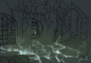
Hey, I hope everyone is progressing swimmingly. I was experimenting with lighting, and I thought it would be cool if my light source came from the ground. I though that since she had magic powers, it would be okay. What do you guys think? Is it too much? Thank you in advance.

Saturday, May 16, 2009

Drawing revision


Hi everyone,
Here is the revision of one of my moment pieces. I had a lot of trouble finalizing this one, and it took me forever to get here. This is going to be an under drawing for my final drawing, so lines are rough and I still need to design some parts...such as the bottom of her dress and the cage in front. I'm going to leave the bird cages on the stairs flat and graphical, but if it's going to be a problem, I'll try to design them better.


I appreciate any suggestion.

kanako


color comps. Opinions appreciated

jorinda wip

wip, i'm trying really hard to keep it loose. but i keep on rendering it ugh. any crits about things not working would help great.

Friday, May 15, 2009


Here is my drawing after making changes based on JP's critique. Some things need to be cleaned up, but I redrew Joringel's arm and hand, as well as Jorinda's. i also reworked her dress and fleshed out the feathers. The background is new as well. As of right now the left hald of the composition is feeling really plain. I would love to hear some feedback to know if things are working better; I am going to try and get through color comps tonight. Thanks!

Wednesday, May 13, 2009

These are my most recent comps, I tried to address as much issues as I can from crits I been receiving since Monday. Let me know if everything working ok.
Here's some different color passes for one of my exteriors. I don't really know which one to go with, so it'll be cool if I could get some feedback to help choose. Thank you!


I've been trying to work the pose out. I think her legs would be covered by the dress, so it won't really show. I hope it's working a little better. The feathers are really loosely painted in. Not much thought was put into the shapes yet because I've been focusing on her pose. Thoughts and suggestions are more than welcome!